Selling the Weather
App Store Visual Direction & Premium Subscription Pipeline
Company
AccuWeather
Role
Art Director
Led App Store visual direction. Directed junior and senior designers on asset production and localization. Worked with motion designer on app preview videos. Built the A/B testing program with the UX team. Collaborated with a senior product designer on the Premium+ landing page and upsell system.
Campaign Direction
A/B Testing
Localization
Conversion Design
Onboarding
AccuWeather’s app reaches 1.5 billion devices across iOS and Android. I led visual direction for both stores for 2.5 years, four seasonal campaigns per year, the same designs adapted across platforms, localized into eight languages, A/B tested, through to the full Premium+ subscription funnel.
Seasonal Campaigns
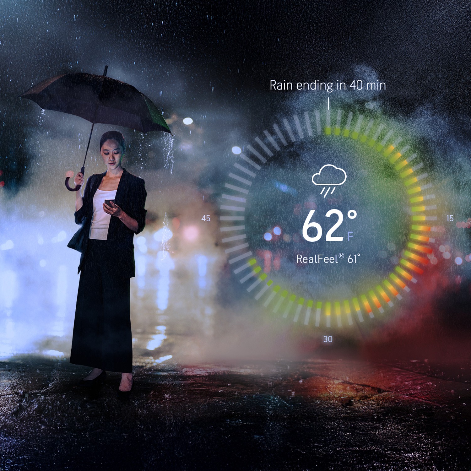
Each campaign was a distinct visual world built with consistent structural grammar. The 2021 campaigns used a dark, cinematic treatment, rainy-night backgrounds, the app UI floating at an angle, urgency without alarm. The subsequent campaigns shifted entirely, with season-specific palettes created to make the viewer feel the time of year without having to read a word. I defined visual direction, designed all graphic elements, and shaped headline copy with our copywriter.


A/B Testing
The testing program was created with the UX team and copywriter, starting with the most fundamental question (flat color or photography?) and evolving over time toward headline variants and feature-ordering tests. I directed all test variant designs; UX structured the tests and tracked conversion data; the copywriter developed the headline copy to test.


Localization
Every campaign was localized into eight languages. Translations were sourced externally and coordinated by the project manager. Once translations got to my team, junior and senior graphic designers manually adapted every asset: adjusting text sizes, line breaks, and layout for different character counts and reading patterns. Every language version was treated as its own design problem, not a find and replace.

Premium+ Landing Page
The Premium+ landing page was a genuine design collaboration, a senior designer, a senior product designer, and I each brought initial directions and synthesized them into the final system. Briefed by product, the page drove conversions from App Store ad placements: seasonal visuals consistent with the current campaign, feature callouts, and a direct path to checkout. The language established here carried directly into the in-app upsell carousel.
Premium+ Upsell Carousel
The in-app carousel was designed to extend the landing page system into the purchase flow without friction. Six feature screens, Ad-Free, Alerts, Hourly Graphs, Widgets, Persistent Notifications, Health & Activities, each using a consistent structure against a seasonal gradient, leading to a pricing screen. The same visual language, now native to the app environment.

Onboarding
The onboarding flow sat at the other end of the funnel, the first experience after downloading, before a user had any reason to pay. Every permission request was reframed as a user benefit, with full-bleed atmospheric photography holding the brand’s cinematic register from the welcome screen through the final notification ask. The same visual system, consistent from first impression to conversion, across iOS and Google Play.

Challenge
AccuWeather’s App Store presence had no seasonal cadence and no testing program, a missed opportunity in one of the most crowded store categories, where visual direction directly affects installs and premium conversion.
Approach
Treat the App Store as a living campaign asset: seasonal, tested, emotionally resonant. Design the full premium funnel, from App Store discovery through paid subscription, as a single connected experience.