Feeling the Heat
Reimagining Heatwave Broadcast Graphics
Company
AccuWeather
Role
Art Director
Sole designer on a focused brief within the broader broadcast system I built for the network. Responsible for all design decisions from information hierarchy through production-ready execution.
Data Visualization
Broadcast Graphics
Accessibility
Information Design
AccuWeather’s heatwave graphics had a problem that had nothing to do with data, they had too much of it. The brief was to simplify. The real job was to decide what the graphics were actually for.
Inherited Graphics
The Heat Wave Severity Index was a proprietary score combining duration and intensity into a single number, a genuinely useful tool that the design failed to communicate. The graphics added explanatory screens, a bar chart, and a comparative ranking table, each requiring viewers to hold context from the previous one. On live broadcast, that context disappears the moment the segment ends.


The Redesign
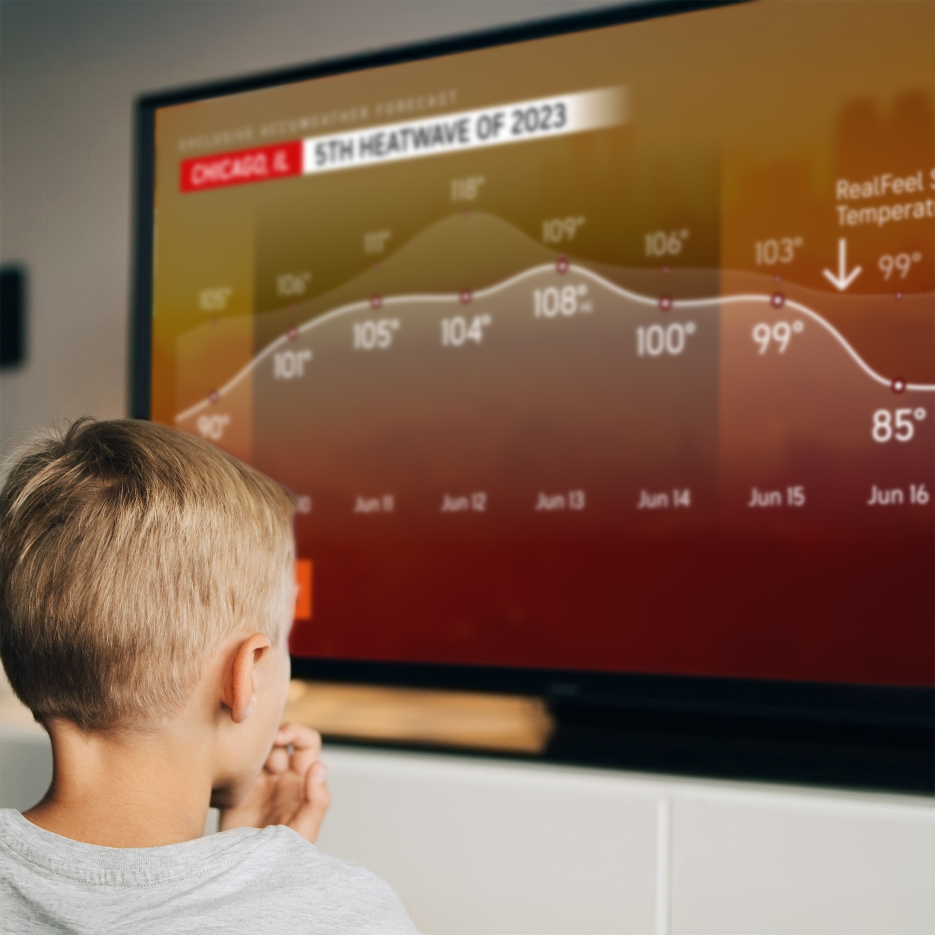
Warm amber-to-deep-red photographic backgrounds that make the screen feel like the subject. A dual-line temperature curve forecasted high as a solid white line, RealFeel Sun as a dotted line above, where the gradient darkens through peak days and lifts as temperatures fall. The arc of the event is visible at a glance. The rankings table replaces raw index scores with color-coded severity labels drawn from AccuWeather’s existing danger scale language, the same system viewers already know from severe weather coverage.


Challenge
AccuWeather’s heatwave graphics tried to introduce, explain, and apply a proprietary severity index simultaneously. Technically accurate, practically unreadable on live broadcast.
Approach
Build the comparative context into the visual structure itself, so viewers can read severity at a glance without learning a new scoring system first.