Interface as Instruction
Guiding User Behavior in Medical Environments
Company
TGR
Role
Lead Designer/Creative Director
Creative Director and lead product designer. Ran all discovery sessions with Tech Ops and the CEO, set the project timeline, and made all key design decisions. Collaborated with a junior designer on execution, Dev team for the build, and with Tech Ops and the CEO on the behavioral strategy that drove the redesign.
Product Design
UX/UI
Information Architecture
Operator Experience
TGR’s A1 robot is capable of autonomous UV-C disinfection across an entire hospital ward, navigating, hitting pre-mapped points, logging every run. Most operators weren’t using it that way. The redesign’s job wasn’t to just make the app prettier. It was to make the right behavior the default.
Full UX and UI from discovery to production-ready specs, delivered in 6 weeks with a two-person design team.
The Legacy App
Built by the engineering team in China and machine-translated into English. Popups reading ‘Are you sure to switch language’ and ‘The scanned map will be lost if exist’ eroded operator confidence constantly. The area filter was an unlabeled dropdown in the corner of the room list and user flows were convoluted, with multiple buttons that do the same thing. The visual language read as a consumer wellness app, soft teal headers, rounded cards, communicating none of the precision a clinical environment requires.

Discovery & IA
I ran all discovery sessions, auditing every screen and flow, building a clustered pain point map from Tech Ops conversations, and defining personas grounded in actual EVS operator behavior. New information architecture was mapped end-to-end for every major flow before any UI began, including error states and recovery paths.


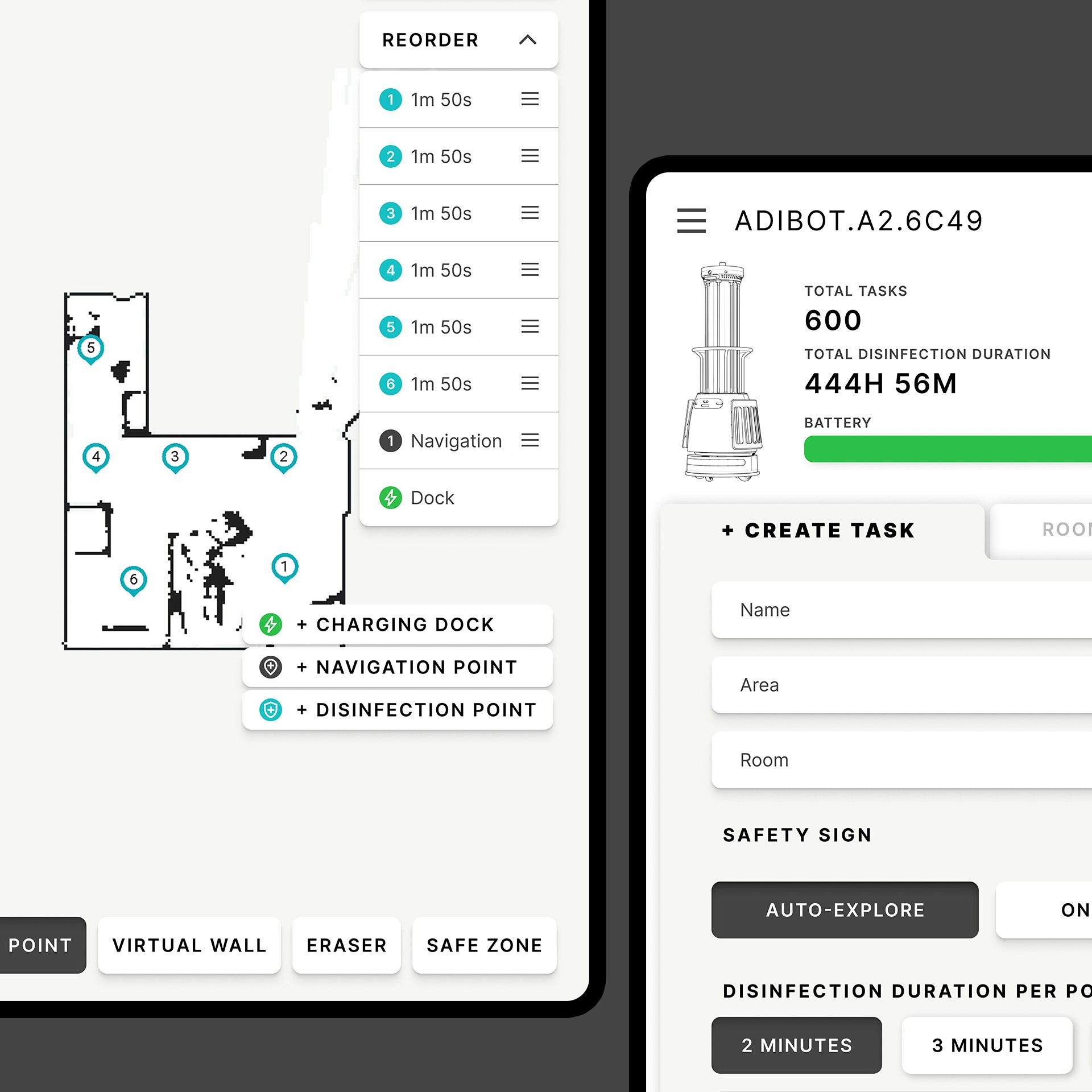
Task Creation & The Core Decision
Use Map is the default operation, no other modes are present. Operators are guided through tasks with a subtle stroke around the next available action item. Switching to On-the-Spot or Auto-Explore requires intentionally tapping a small button stating "Don't Use Map", triggering a confirmation popup, with clear language that the operator is knowingly deviating from standard protocol. Developed in direct collaboration with Tech Ops and the CEO, who wanted the interface to carry accountability for operator behavior. This single decision restructured everything else around it.


Room Management & Map Editing
Area ▸ Room breadcrumb navigation appears in the header of every relevant screen, eliminating the hidden dropdown that caused constant misfiling. Map editing rebuilt with a persistent bottom toolbar — Edit Point, Virtual Wall, Eraser, Safe Zone — and a drag-and-drop reorder panel for sequencing disinfection points. An experience operators could learn once and rely on.


Scheduling & Monitoring
Scheduled Tasks rebuilt as a proper management view, filterable by area, week, and operator, with full task configuration visible at a glance. The live task view introduced a timestamped event log giving EVS supervisors an auditable record of every run. A new missed-spots recovery flow turns incomplete runs into documented, recoverable situations rather than silent failures.


Visual System
The consumer softness of the original was replaced with a clean, clinical, high-contrast system aligned with TGR brand standards: all-caps labels and UI chrome, always-visible connection status dots, functional color (teal for primary actions, amber for edit states, red for destructive, green for confirmations). Actions are reveal-as-you-go to prevent cognitive overload. All copy rewritten in plain English, every translation error eliminated.
Before


After


Challenge
TGR’s autonomous disinfection robot was being underused, not because it was broken, but because the app made the wrong behavior easier than the right one. Operators were bypassing autonomous disinfection entirely, using a state-of-the-art robot as a stationary UV-C lamp.
Approach
Establish a default flow where the correct behavior is never in question. Make opting out feel like a deliberate, accountable deviation from standard protocol. Rebuild the hierarchy, language, and visual system to support that single decision.